Part 3: Types of Pages
When you add a page to your Google site, you're given four different options.
Option #1: Your basic webpage
This is just your traditional page that could include text and links to other subpages. Here's an example of a page of my website that uses this option:
Clicking on any of the red text hyperlinks will just take you to another subpage within my website. When you get further into my website, the links might take you to external sites such as games or readings that support the concept I'm teaching. Regardless, this option is the one that I use 95% of the time when I'm adding new pages to my Google Site.
Option #2: Announcements
This is a lot like a blog-feature for your website, but without a lot of bells and whistles. It's a page that you can update frequently, and the most recent update will appear at the top of the page. For my class website, I use this type of page to post homework and announcements.
Option #3: File Cabinet
This option is a way for you to upload files and make them available to others to download. I have a page of my website simply called "Filing Cabinet" and it's where I'll upload any of the frequently used pages that students are likely to need or misplace (e.g., reading logs, spelling contracts, extra grid paper for a math assignment, etc.). You can organize the contents into folders, add descriptions, and automatically leave info about what version it is (if you replace a file, for example) or when you uploaded it so parents can see recent additions. I love this page because it really eliminates a lot of homework excuses.
Option #4: List
I'll be honest -- this is a feature that I've never used. The description says that it lets you make and organize pieces of information (lists!), but I've never had a situation where I really needed to do that on my website. Perhaps it would be good to use if you were organizing a field trip or something like that.
Part 4: Organizing Your Site
When you first set up your website, you'll just have a Home Page -- at least, that's the case if you use a blank template. From there, each additional subpage that you add will either be nested at the top level, or you can choose to nest it under something else. Here's an example.When you look at the Navigation side bar on my website, you can see several subpages listed.
These are all of the pages that I've created at the "Top Level" because I thought they should be easy to find and I wanted it to be fairly easy to navigate. I put all of my most important or big topic pages as "Top Level." The only exception is "Biography Project Choices" -- which is only listed there because I wanted my students to find it immediately for an in-class activity.
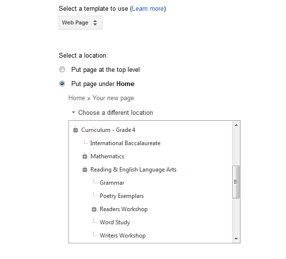
If you click on "Curriculum - Grade 4," however, you can see the subpages that I've nested beneath it listed at the bottom of the "Curriculum" page.
To do that, I just click "Put page under Home" and then select the option "Choose a different location" when I'm adding a new page. This will show you all of the top level and subpages you've already created.
One of the things that I really like about the site is that no decision has to be permanent. If you want to reorganize your site -- something I'll do with mine this summer -- you can always move pages around. Just go to the page, click "More" along the editing options at the top, and then choose "Move Page" and it will take you to a menu just like the one above. It's very easy to organize and re-organize in that way, and it will update all of your links automatically.
Homework :)
If you're working on starting your own Google Site this summer, play around with the different types of pages. Try to create a curriculum page, an announcement page, and a filing cabinet. You are welcome to check out my website if you need ideas, but just remember that it's a work-in-progress. In fact, I think classroom websites are always a work-in-progress. I'm constantly adding links to new resources I find or reorganizing it to better suit my class and my instructional needs. Don't feel like it needs to be "100% done" before you share it because honestly, you'll probably never reach that point. Some information is better than none.
What features do you want to include or already use in your classroom website? Please share some of your ideas in the comment section as I would love to hear them!


WOW! I learned a ton just by reading this one post!
ReplyDeleteI am glad to be a new follower!
Kim
Finding JOY in 6th Grade
Alison, I love your post. I am actually thinking about doing a Web page with QR codes for my kids to get to them for my team next year. I just might be able to figure this out. I am giving you the Leiber Award. Come on over to my Blog and pick it up. However don't be surprise if I didn't link up to you right, I can't figure out how to grab a button to save my life. Happy Blogging.
ReplyDelete